Primary Color (Signature Color)
Black is UNO’s primary brand color. Black should be front and center on all external projects to spread the brand identity of UNO to a broad audience.
Secondary Colors
Dark gray, light gray, and white may be used as secondary colors to support the primary color. In certain cases, secondary colors may be used as the dominant color for large color blocks for different graphic uses.
Accent Color
Red is UNO’s accent color, used to accentuate the primary color and secondary colors.
Color Application Guide
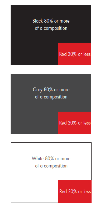
Black, gray, or white should be the dominant color in UNO branded communication materials.
Red should be used sparingly, only as a pop of color, and should not take up more than 20% of any composition — under no circumstances should red become the dominant color on branded materials.
Wellness Colors
The Wellness color palette was established as a visual representation of the graphic indicators associated with the 8 Dimensions of Wellness and is only allowed to be used for this purpose.
The Wellness Colors are not an extension of the UNO color palette or meant to be used on any general branding materials or communications.
Color Application Guidelines
- Black should be featured prominently in visual communications from UNO.
- Red is not a primary color and should not make up more than 20% of any composition.
